How might we encourage website users to join the community?


How might we encourage website users to join the community?
8 weeks (Design)
8 weeks (Build)
Joanna Choi (UX/UI Designer)
Yoko Kristiansen (UX/UI Designer)
Figma
inVision
Webflow
To understand the ask, I met with Slant'd's creative director to define the scope and the brand aesthetic. When I met with the client, she answered questions I had about the goal of the website, the audience, and important pages to consider. Next I conducted a heuristic evaluation of the existing website to assess existing problems. After gathering my research, I created a persona to understand the site's user. I organized a site map and user flow to map the flow of the website. Next, I designed the website in low, mid, and high-fidelity. After each design iteration, I conducted usability tests with users and incorporated feedback into the designs. After finalizing the design, the creative director and I built Slant'd's website using Webflow.
Scope Definition
Heuristic Evaluation
Persona
Site Map
User Flow
Mid-High Fidelity Wireframing
Mid-High Fidelity Prototyping
Usability Testing
Build in Webflow
I had questions about Slant'd's goal and the overall purpose of the website that would help inform my design process. During the kick-off meeting with Slant'd's creative director, I discovered the following important information:
I conducted a heuristic evaluation of Slant'd's existing website to understand what problems users were facing as they navigated the site.
On multiple pages, there were CTA buttons that did not have clearly defined purposes. On the Landing Page, there were two options side by side with no information about the difference between the two CTA's. On the Membership page, I noticed two CTA buttons for a membership and subscription, which were not clearly differentiated.

Slant'd has a brand that is bold and expressive. On the Submissions page, I noticed that the instructions for submitting writing pieces was long and boring, taking away the delight factor of the user experience.

I created a persona of the typical Slant'd member to understand how they became interested and joined the community.

I created a site map to define the website hierarchy. This informed how we would design the Landing Page and the subsequent pages.

During usability testing, we asked users to purchase a previous Slant'd magazine issue. We created 3 different paths that users took to navigate to the product page.

Our process for designing wireframes was as follows: mid-fidelity design > usability tests > high-fidelity design > usability tests > final design. We conducted usability tests after each round of design to ensure that our design was functional and intuitive for users.
The left image is our mid-fidelity design and the right image is our final high-fidelity design.

During usability testing for both mid-fidelity and high-fidelity, we found that users had trouble differentiating between a membership and a subscription. After multiple rounds of iterations, we decided on the following design because it clearly differentiates the price and plan for each option.

As a result of the coronavirus pandemic, Slant'd has turned their upcoming events from physical to virtual. After multiple rounds of iterations on the high-fidelity wireframes, we decided on the following design because of the clean delineation of event types (show all, virtual, IRL) and easy-to-read format for the event information.

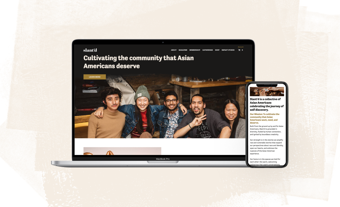
Slant'd is an organization for Asian Americans celebrating the journey of self discovery through personal storytelling and gatherings. Keeping this in mind, we re-designed Slant'd's website to be colorful, daring, and creative. We conducted multiple rounds of usability tests at each iteration to ensure the functionality of the website as we explored bolder ways to express Slant'd's mission. As a result, we have launched the website, released a literary magazine and community cookbook, hosted 9 online events, and launched an online fundraiser that exceeded its goal by 248%.
Through this project, I worked tirelessly to learn how to use Webflow to build websites. This experience gave me a better understanding of the constraints that engineers have to work through and how I can make my designs more engineering-friendly. Fortunately, because we were able to do so much usability testing, this project reminded me to always test concepts early on to prevent running into problems in the future.